

Think about the last time you bought a product, looked up a local service, or researched a quick question online. Dynamic odds are, you didn’t wait until you were sitting at a desk to do it. You pulled your smartphone out of your pocket.
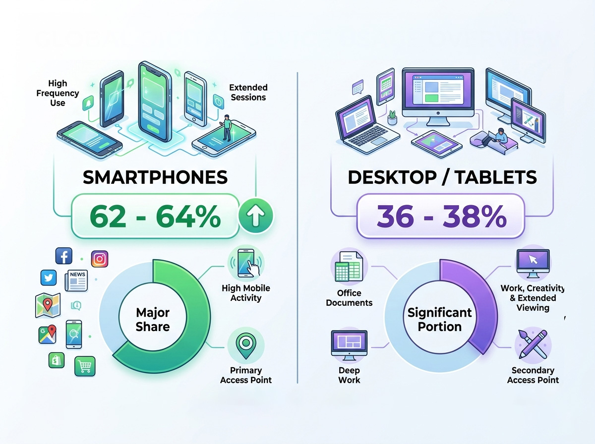
The Cold, Hard Data: Mobile is the Majority
To understand the sheer scale of this shift, look at the benchmarks driving the digital economy:
2. The Critical Link: API Integration Between E-Commerce and ERP
The most common point of failure for growing retail brands is data fragmentation. If your website says an item is in stock, but your physical store just sold the last unit, you face a customer service nightmare.
This is where the Application Programming Interface (API) becomes the backbone of your business. The API acts as a translator and messenger between your E-commerce Platform and your Enterprise Resource Planning (ERP) system.
Why “Responsive Architecture” is Non-Negotiable
Some businesses try to cut corners by building a separate “mobile version” of their site (like an old m.yoursite.com address). This creates broken links, a nightmare for content management, and severe penalties from search engines.
The modern standard is Responsive Web Design (RWD).
What is Responsive Architecture? It is a development approach where a single website uses fluid grids, flexible images, and CSS media queries to automatically detect the user’s screen size and adjust the layout seamlessly.
Whether your customer is on an ultra-wide desktop monitor, an iPad, or a compact Android or iPhone, a responsive framework dynamically reorganizes the layout elements to ensure text remains perfectly readable, buttons stay tappable, and images scale gracefully without clipping.
The Traffic-Conversion Gap (And How to Fix It)
Despite driving nearly 78% of retail traffic, mobile conversion rates historically lag behind desktop (hovering around 2% for mobile web compared to nearly 4% on desktop). Why? Because of friction.
Users are easily distracted on phones, data connections can fluctuate, and filling out long forms with a thumb is annoying. 40% of users will immediately jump to a competitor after a poor mobile experience.
Tips to Master Mobile-First Optimization
To bridge that gap and turn mobile browsers into buyers, your design must be tailored to mobile behavior. Focus on these core implementations:
Designing for mobile-first isn’t just about technical aesthetics, it’s about meeting your customers exactly where they are. Contact the team at WAKOZ today for a consultation.